

The Brief:
Kichiota Indigenous Destinations is a first-of-its-kind partnership between Whitecap Dakota First Nation (WDFN), Wanuskewin, and Beardy’s and Okemasis’ Cree Nation (BOCN). We were entrusted with creating a visual identity that conveyed the essence of this partnership, ensured visual and language sovereignty, and provided a platform to promote Indigenous tourism in Saskatchewan.
Solution:
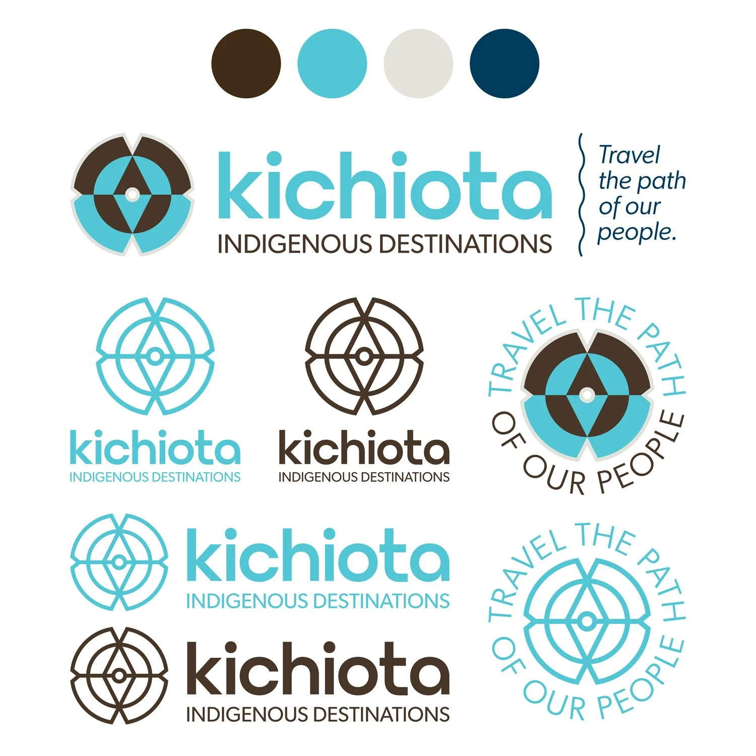
The success of this project hinged on close collaboration with each partner and, in the cases of WDFN and BOCN, members of the community including Elders and Knowledge Keepers. These consultations inspired the name (Kichiota), an original word that joins Cree and Dakota to produce four translations (“Here with”/“Lots of importance”/“Here is special”/“Many are with”). The sense of place evoked by the name and tagline (“Travel the path of our people”) extends to the logo and supporting visuals.
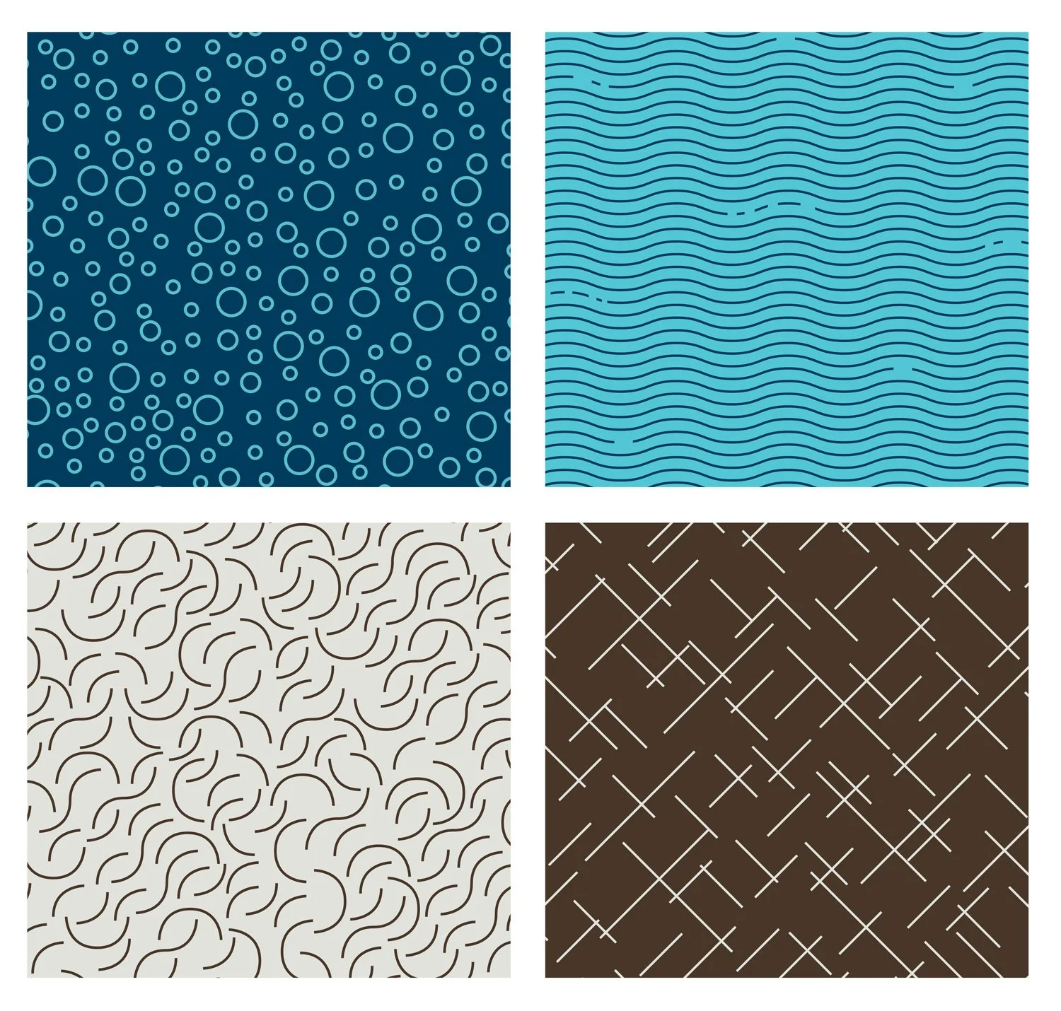
The logo icon contains a reflected tipi, but may also be interpreted as a compass or flower. Its shape references the four directions and features two distinct hemispheres (north/top and south/bottom). Strategic colourization suggests the top as sky and the bottom as land. We chose a brand palette of organic, natural colours to differentiate Kichiota from other Indigenous businesses. Teal is associated with restfulness and mental and spiritual balance, while brown suggests honesty, strength, and security. Kichiota’s pattern library flexibly mimics what is found in nature. Drawing from the theory of wahkotowin (kinship), everything is related and one thing can be many. For example, the dots may represent stars in the sky or bubbles in a fast-flowing current.
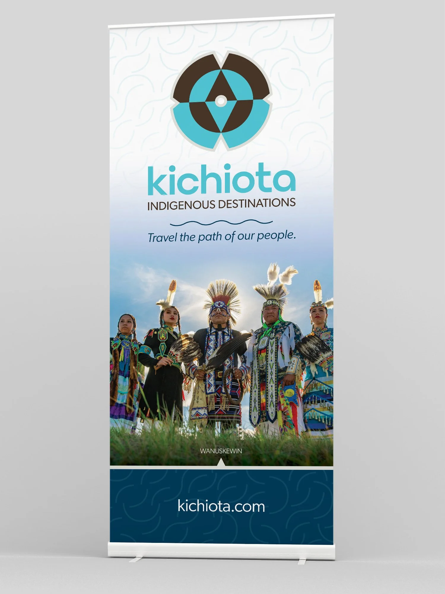
An in-depth brand guidelines document was developed, as well as a merchandise guide and tradeshow materials.
My Roles:
creative direction, art direction, design
Other Credits:
Tim Neal (The Engagement Party) - creative direction, art direction, design
Calvin Xiao - brand strategy
Jess Reimer - copywriting, content strategy