


The Brief:
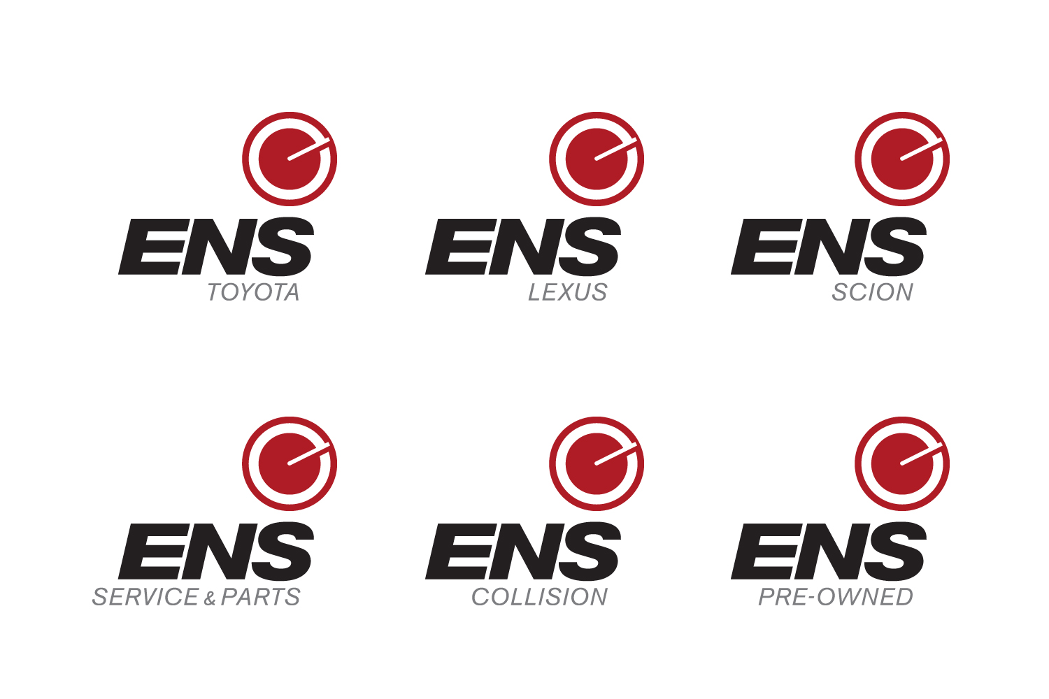
Ens is a dealership with over 50 years of history in Saskatchewan. Ens has many divisions, with Toyota and Lexus divisions, a Service Centre, a Collision Centre and an Industrial vehicle department. Ens was moving to a new facility, and developing a cohesive brand identity was the next step. After extensive research, we determined that Ens needed to develop a logo to establish itself independent of its products, while complementing and acknowledging them at the same time.
Solution:
The rebranding of a 50-year-old local auto company presented many challenges. Our goal was to create an easily recognizable logo that will remain timeless for the next 50 years. We developed the logo to be versatile, so that it can be used on everything from pens to full 3D animation. It also needed to represent the dealership’s auto brands without aligning too much with any particular one. Not only does the ‘e’ in this logo represent the Ens brand, but it can also be a seen as a speedometer or gauge. Circles are traditional automotive symbols, but in this case, the shape is presented in a simple, modern form.
My Roles:
concept, design, art direction