


The Brief:
Saskatoon’s Core Neighbourhood Youth Co-op (CNYC) is a grassroots organization living on individual donations and small grants, while doing amazing things for at-risk youth living in Saskatoon’s notorious west side. To make CNYC a contender for game-changing grants and corporate sponsorship, a new visual identity was needed.
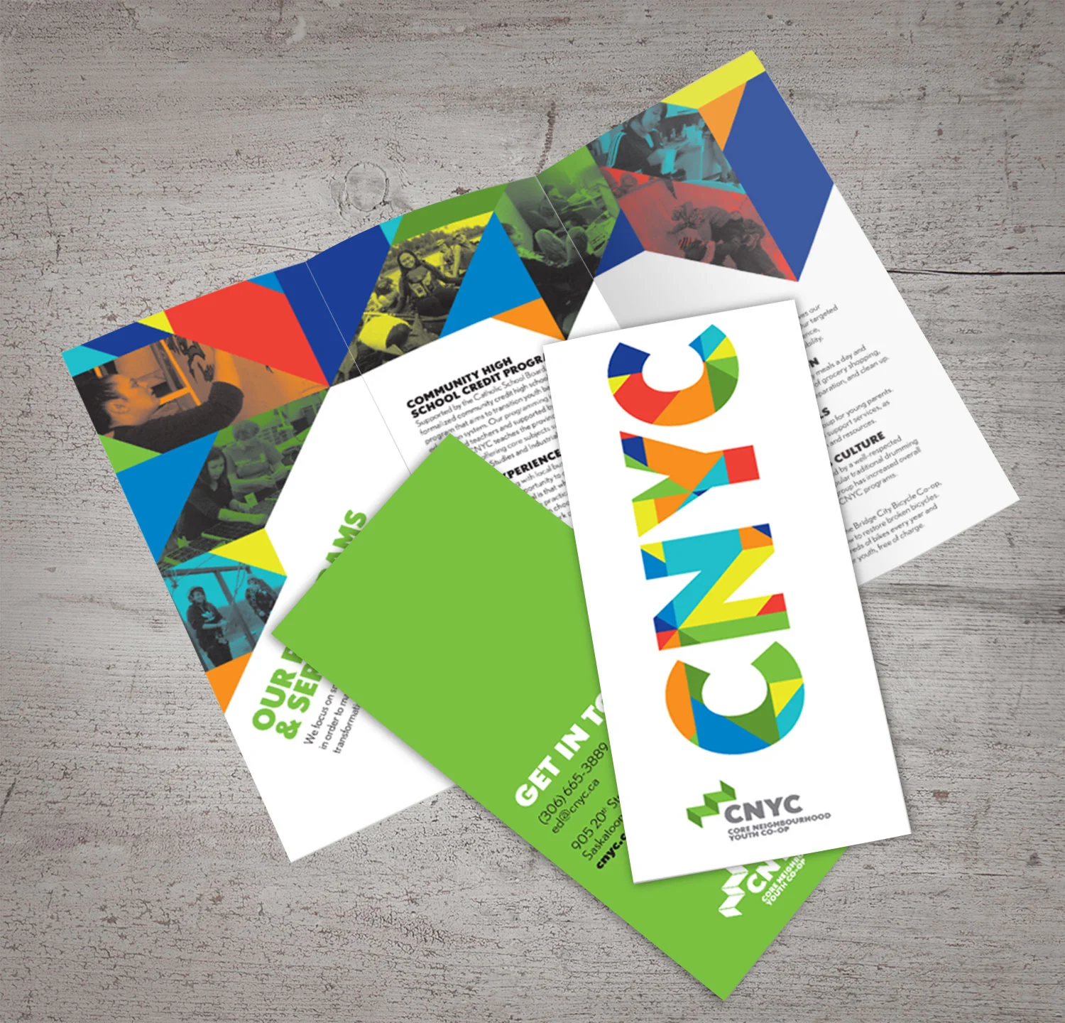
Solution:
The ‘steps’ icon represents the life skills that participants gradually develop. It is also a subtle nod to the rooflines of the CNYC home base. A vibrant colour palette was requested to make a reference to their previous branding. A geometrical pattern, inspired by First Nations star blankets, was developed.
Aside from the visual identity, initial projects included stationery templates, an informational brochure, and a branding iron to label carpentry projects.
Results:
This project was recently awarded a Merit in the Premier's Awards of Excellence in Design, at SK Design Week 2015.
My Roles:
concept, design, creative direction
Other Credits:
Rebecca Harbin - pattern design